Thursday, October 27, 2011

Assignment #10-Political Poster Analysis

Image A: Don't Let USA Rule M' sia [Malaysia]: Stop the Free Trade Agreement
2006
2010.54.1043 | OMCA COLLECTIONS

Purpose
-The documents purpose is to show that don't let the government completely control you like a puppet.
-Bush's was still president during 2006, and Americans were disliking how he was running things.
-This poster uses images of a man with American color jacket using Americans as puppets.
-This document is for people who believe anything the government tell them.
-This document suggests that people are ignoring the real facts, and believing the governments word.
-I believe at the time this poster was created it was really accurate.

Document Author
-No author.
-The writers motives are to convince Americans that the government will control you as a puppet.

Evidence, Support, and Outcomes
-Not every president completes everything he promises, the affects are believable.
-It uses logic emotion, to persuade its reader and to make it feel that the government does not complete its promises.
-The moral value is that is not good to promise something and not keep it.
-If the audience accepts this message they will see the reality of the government.
-If everyone in the world saw this message people would analyze their government more.

Overall Impression and Conclusions
-The overall impression is that the government can control you if you are on their political side.
-I believe this poster is a persuasive poster because it wants Americans to show how the government controls Americans.

Image B: When I walk in the fields with my soul in the wind..., 10/27/11
2010.54.415 | OMCA COLLECTIONS

Purpose

-The documents purpose is to get all the Latinos attention and get health care.

The message of this document is to promote health care for all Chicanos and Latinos.

-It is important for this message to be delivered because a lot of Latinos do not have health care so its saying we should protest to get health care.

-The document communicates because it shows the welga bird with two swords. It uses really nice red and yellow. -On the top it says in really big letters, "Raza Health Conference."

-The audience are Latinos and field workers as well.

-The message suggest that the farmers need health care because they work on the fields and they can get sick.

-The beliefs are really accurate because it is directed to all the Latinos and the farmers. Which a lot of Latinos don't have health care til this day. Either we don't qualify or you have to have papers.


Document Author

-Pablo Neruda wrote the message.

-The writers motives is to get all the attention from the Latinos and let them know we can make a change or difference. If we fight for it, all of the Latinos can get health care.

Evidence, Support, and Outcomes

-The details that the documents use are the welga bird. That is a big thing becaus that represents the Latinos.

-The emotions show a good and powerful feeling.

-The audience is likely to feel worried and willing to go fight for their rights.

-The ethical values are used to communicate to the message are Chicano and the picture.

-If the audience accept the message all the Chicanos will come together and make a difference.

-All the farmers and Chicanos will get health care.


Overall Impression and Conclusions

-The overall impression of the message is to tell the Latinos and farmers to get health care.

-I believe is an argument because its trying to fight for the farmers rights.


Thursday, October 13, 2011

Assignment #8 Cubism & Pablo Picasso

Analytical Cubism

Mandolin
http://www.artchive.com/artchive/P/picasso/tellier.jpg.html

The musical instrument captures my eye in this image, i like the shading. Dark colors are used specifically brown and green, and different shades of those colors. Line texture and shape are being used. Center of design is the principle of design used. This influences my painting by shadowing my body around the background of my Picasso self portrait.

Braque Violin
http://davidtmiller.wordpress.com/2008/11/12/information-distribution-systems-cubism-as-visual-language/

The Violin captures my eye, i like the contrast of the picture. Different shades of colors are being used mainly brown and a mixture of black. Line texture and shape are being used. Balance is being used, everything is equally spread around. This painting influences me to use different shades of one color in my Picasso self portrait.

Ambrose Vollard
http://artedeximena.wordpress.com/arte-contemporaneo/i-las-vanguardias-historicas/cubismo-y-esc/cta-retrato-de-ambroise-vollard-1910-picasso/
The mans face captures my eye, i like how his face is the lightest part in this dark piece. One main color being used which is black, the one light color to see the significance in the image. Line texture and shape are being used. Center of interest is being used to focus on the mans face. This painting influences me to make a significant color change in my self Picasso portrait.

Still life With a Bottle of Rum
http://www.metmuseum.org/toah/works-of-art/1999.363.63

The letters capture my attention, i like how letters are used in his artwork. The colors, are gold, brown, Grey, and black showing a stable emotion. Line texture and shape are being used. Balance is the principle of design being used as you can see everything is spread out trough out the painting. This influences me to put letters or some type of letter shape in my Picasso self portrait.

Friday, October 7, 2011

Assignment #7 Principles of Design

• Balance - a feeling of equality of weight, attention, or attraction of the various elements within the composition as a means of accomplishing unity

http://www.nyu.edu/classes/keefer/body/sci.html

• Movement - the suggestion of action or direction, the path our eyes follow when we look at a work of art

http://www.nyu.edu/classes/keefer/body/sci.html

• Repetition and rhythm - the act of repeating an element either regularly or irregularly resulting in a rhythm of the repeating elements

http://hannakaye.wordpress.com/

• Emphasis - the stress placed on a single area of a work or unifying visual theme

http://www.vldb2005.org/tourism/main.php?day=20050830

• Simplicity (a.k.a. visual economy) - the elimination of all non-essential elements or details to reveal the essence of a form

http://www.elfwood.com/~hession/Contrast.2796374.html

• Contrast - the difference between elements or the opposition to various elements

http://www.elfwood.com/~hession/Contrast.2796374.html

• Proportion - the relation of two things in size, number, amount, or degree

http://lynbrown.com/?p=1262

• Space - the interval or measurable distance between objects or forms (two dimensional or three dimensional)

www.Google.com

• Unity - the relationship between the individual parts and the whole of a composition


http://www.artreview.com/profile/VisionaryArtistIntuitivePsycgic

Friday, September 30, 2011

Asssingment #6 Pablo Picasso Cubist Painting


Me With a Twist

My Picasso painting is called “Light Shadow”. My main influence on my painting was the color Picasso used. He influenced me to show the significance in my painting, which was light and dark. Picasso used different colors in different era paintings. I wanted my painting to look like Picasso’s are in a way, but yet somehow have my own taste and incorporation in it. In my work of art i used Line, Color, and shape. My biggest incorporation was my face, yet i made it look like a Picasso self portrait.

To create my artwork I worked in the multi media medium. It was as self portrait of myself, in which i took a picture of myself and uploaded it to photo shop. Then I warped and painted my portrait to make it look like a Picasso painting. The assignment was to create a self portrait of yourself, but to make it look like if Picasso had painted it in one of his era’s. I made it look a lot like his cubism period in which Picasso made most of his art work with shapes.

I used Value in my Picasso self portrait painting, on the left side of painting i put very light colors and bright, then to my right side i put dark colors to show the nice and mean side of me. I also used lines to show the edges and where things ended on my portrait. I mostly used it around my face and half of my body. I also used color to show the lightness of my portrait and significance in it. The final element of design i used was shape to resemble to Picasso’s cubism period.

In my portrait I wanted to show two sides of my self, but yet still incorporate Picasso’ style in my painting. On the left side of the painting I put light lines and light color painting on the left side of my face. I put to show how happy i can be, and also nice. On the right side of my face i used dark colors and no lines to show the mean and sad part of me. Overall I used a happy and sad emotions.

Of all the portraits i have made of myself, I believe this portrait was my most successful. It really looks like a Picasso painting. If i could do something to improve, I would take more time in studying Picasso art work to be on point.

Thursday, September 29, 2011

Assignment #5 Elements and Principles of Design


• Line - an actual or implied mark, path, mass, or edge, where length is dominant

http://www.indiaonrent.com/view/c/continuous-line-art-creative-pics.html


• Form - the mass of the shapes

http://cutestfood.com/2447/apple-art/

• Texture - the structure and minute molding of a surface (rough, smooth, etc.)


http://popartmachine.com/blog/art-textures-grunge-pop-art-paintings.html

• Value - the degree of lightness or darkness of a given color


http://www.debate.org/debates/Wealthy-is-a-relative-term-rather-than-an-absolute-one./1/

• Color - a pigment


http://www.asia.ru/en/ProductInfo/934336.html


• Shape - any flat area bound by line, value, or color

Thursday, September 22, 2011

Assignment #4 Pablo Picasso WebQuest

Les Demoiselles d'Avignon
(1907)

http://www.moma.org/collection/object.php?object_id=79766


1. What is his full name?
Pablo Diego José Francisco de Paula Juan Nepomuceno María de los Remedios Cipriano de la Santísima Trinidad Clito Ruiz y Picasso
2.When was he born?
25th October, 1881 in Malaga in Spain.
3. When did he die?
8th April 1973, Mougins France.
4. Find out the names of his parents,brothers or sisters.
José Ruiz and María Picasso y López, Parents Sister Conchita Y Lola
5. What were the names of Picasso´s wives or lovers? What were their nationalities?
Female Olivier, Holga knokhlova and Maecelle Humbert, Jean Cocateu, Jean Hugo, and Juan Gris.
7. What are his children and grandchildren´s names?
Paul, Maya, Claude, Paloma.


8. Which topics did he paint about?
Women, portraits, scenes, and self portraits.
-wikipedia.com

9.Why did he go away from Spain? Where did he live?
He moved to pursue his career in art, he lived in France for most of his life.
10. In which way did he influence the concept of painting?
His father begin teaching him at a very young age, started painting of age of seven.
11. Main events that influenced his life.
His father mainly influenced his life, started teaching him and giving him lessons at age of seven.
12. Describe some people, objects, and/or animals in his paintings(what they look like,the clothes they are wearing,their personality).
They are posing in random positions. Different girls have different faces, there personality looks very serious.

13. Is there anything special about the people´s faces or bodies?
They are abstract, like there faces are mixed. They are not wearing any clothes at all, their are completely naked. Light colors for their skins, and a lot of women, and only women. Some sitting and some standing.


Thursday, September 8, 2011

Assignment #3 How do signs/advertisment visually communicate an idea.

Ads post 9/11
Image A
http://himysyed.tyo.ca/2007/08/01/threadbare-a-documentary-film-about-canadas-war-on-terror-by-arshad-khan/
Image B
http://photonicportal.wordpress.com/category/rumsfeld-bush-cheney-era/

1. These signs are communicating the reward of the terrorist who the U.S. believe caused the 9/11 incident in New York on september 11, 2001.
2.A. Image A describes a picture of a hand in handcuffs, very bloody, signifying that U.S. wants Osama, dead or alive.
B. Image B also describes Osama's wanting in the U.S. either dead or alive.
3. Image B captures my attention more because its more old-school, and original. It looks more like old wanting posters.
Political Signs
Image A
http://emilyblakely.com/2008/10/57/HOPE:+Obama+'08
Image B
http://www.phillipsartexpert.com/forums/11/467/
1.My signs are communicating power and progress, and also hope towards the 2008 election in the U.S.
2.A. In image A it has a picture of words mixed up and shapes making and spelling out "HOPE"
B. In image B it has a picture of Barack Obama and his election in the United States and the word "PROGRESS" under the picture of his face.
3. The image that captures my attention more is image B because it actually shows Obama's face in it.
CD Cover
Image A
http://www.billboard.com/album/gerardo-ortiz/morir-y-existir-en-vivo/1468034#/album/gerardo-ortiz/morir-y-existir-en-vivo/1468034
Image B
http://www.billboard.com/album/gerardo-ortiz/morir-y-existir-en-vivo/1468034#/album/gerardo-ortiz/morir-y-existir-en-vivo/1468034

1.My images communicate there music and who sings it and the name of the album.
2.A. Image A shows a picture of the artist and him playing his instrument.
B. Image B shows the artist posing in the middle with a hat with two sides choosing life over death.
3.I get drawn to image B because i like the artist more than the other in image B.

Candy Wrapper
Image A
http://www.centssaved.com/2011/06/03/free-and-cheap-nestle-crunch-bars-at-king-soopers/crunch-bar/
Image B
http://www.picturesdepot.com/images/18958/hershey+bar.html

1.My images are representing there quality of candy and the type they are.
2.A. Image A shows a picture of a crunch bar half open.
B. A brown wrapper with milk chocolate on the cover.
3.I like image A with the crunch wrapper because its open and shows the chocolate.
Clothing and Shoe company.
Image A
http://cocoperez.com/2009-11-18-ralph-lauren-bullies-real-polo-company
Image B
http://nike-ad-dict.blogspot.com/2009_11_01_archive.html

1.My signs are communicating there selling of their company.
2.A. Men playing the sport polo with Polo brand shirts.
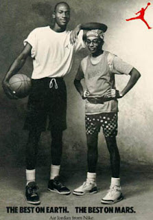
B. Two guys with basketball outfits holding a basketball.
3. image B catches my attention because of the shoes.

Business
Image A
http://partners.visitrenotahoe.com/innoutburger
Image B
http://www.peabody-adv.com/Categories_TV.Ads/pizza.htm

1.My signs are communicating there food products have quality and the best form other persuading to buy.
2.A. It shows a picture of a burger and drink fresh off the grill with a soda and words on top.
B. It shows a pizza with a side next to it fresh out the oven.
3.my second image captures my eyes first because i like pizza more.