Thursday, October 27, 2011

Assignment #10-Political Poster Analysis

Image A: Don't Let USA Rule M' sia [Malaysia]: Stop the Free Trade Agreement
2006
2010.54.1043 | OMCA COLLECTIONS

Purpose
-The documents purpose is to show that don't let the government completely control you like a puppet.
-Bush's was still president during 2006, and Americans were disliking how he was running things.
-This poster uses images of a man with American color jacket using Americans as puppets.
-This document is for people who believe anything the government tell them.
-This document suggests that people are ignoring the real facts, and believing the governments word.
-I believe at the time this poster was created it was really accurate.

Document Author
-No author.
-The writers motives are to convince Americans that the government will control you as a puppet.

Evidence, Support, and Outcomes
-Not every president completes everything he promises, the affects are believable.
-It uses logic emotion, to persuade its reader and to make it feel that the government does not complete its promises.
-The moral value is that is not good to promise something and not keep it.
-If the audience accepts this message they will see the reality of the government.
-If everyone in the world saw this message people would analyze their government more.

Overall Impression and Conclusions
-The overall impression is that the government can control you if you are on their political side.
-I believe this poster is a persuasive poster because it wants Americans to show how the government controls Americans.

Image B: When I walk in the fields with my soul in the wind..., 10/27/11
2010.54.415 | OMCA COLLECTIONS

Purpose

-The documents purpose is to get all the Latinos attention and get health care.

The message of this document is to promote health care for all Chicanos and Latinos.

-It is important for this message to be delivered because a lot of Latinos do not have health care so its saying we should protest to get health care.

-The document communicates because it shows the welga bird with two swords. It uses really nice red and yellow. -On the top it says in really big letters, "Raza Health Conference."

-The audience are Latinos and field workers as well.

-The message suggest that the farmers need health care because they work on the fields and they can get sick.

-The beliefs are really accurate because it is directed to all the Latinos and the farmers. Which a lot of Latinos don't have health care til this day. Either we don't qualify or you have to have papers.


Document Author

-Pablo Neruda wrote the message.

-The writers motives is to get all the attention from the Latinos and let them know we can make a change or difference. If we fight for it, all of the Latinos can get health care.

Evidence, Support, and Outcomes

-The details that the documents use are the welga bird. That is a big thing becaus that represents the Latinos.

-The emotions show a good and powerful feeling.

-The audience is likely to feel worried and willing to go fight for their rights.

-The ethical values are used to communicate to the message are Chicano and the picture.

-If the audience accept the message all the Chicanos will come together and make a difference.

-All the farmers and Chicanos will get health care.


Overall Impression and Conclusions

-The overall impression of the message is to tell the Latinos and farmers to get health care.

-I believe is an argument because its trying to fight for the farmers rights.


Thursday, October 13, 2011

Assignment #8 Cubism & Pablo Picasso

Analytical Cubism

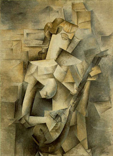
Mandolin
http://www.artchive.com/artchive/P/picasso/tellier.jpg.html

The musical instrument captures my eye in this image, i like the shading. Dark colors are used specifically brown and green, and different shades of those colors. Line texture and shape are being used. Center of design is the principle of design used. This influences my painting by shadowing my body around the background of my Picasso self portrait.

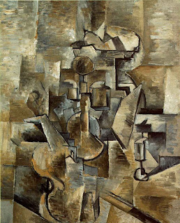
Braque Violin
http://davidtmiller.wordpress.com/2008/11/12/information-distribution-systems-cubism-as-visual-language/

The Violin captures my eye, i like the contrast of the picture. Different shades of colors are being used mainly brown and a mixture of black. Line texture and shape are being used. Balance is being used, everything is equally spread around. This painting influences me to use different shades of one color in my Picasso self portrait.

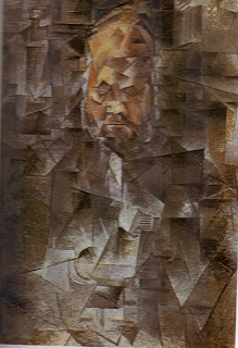
Ambrose Vollard
http://artedeximena.wordpress.com/arte-contemporaneo/i-las-vanguardias-historicas/cubismo-y-esc/cta-retrato-de-ambroise-vollard-1910-picasso/
The mans face captures my eye, i like how his face is the lightest part in this dark piece. One main color being used which is black, the one light color to see the significance in the image. Line texture and shape are being used. Center of interest is being used to focus on the mans face. This painting influences me to make a significant color change in my self Picasso portrait.

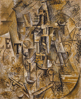
Still life With a Bottle of Rum
http://www.metmuseum.org/toah/works-of-art/1999.363.63

The letters capture my attention, i like how letters are used in his artwork. The colors, are gold, brown, Grey, and black showing a stable emotion. Line texture and shape are being used. Balance is the principle of design being used as you can see everything is spread out trough out the painting. This influences me to put letters or some type of letter shape in my Picasso self portrait.

Friday, October 7, 2011

Assignment #7 Principles of Design

Balance - a feeling of equality of weight, attention, or attraction of the various elements within the composition as a means of accomplishing unity

http://www.nyu.edu/classes/keefer/body/sci.html

Movement - the suggestion of action or direction, the path our eyes follow when we look at a work of art

http://www.nyu.edu/classes/keefer/body/sci.html

Repetition and rhythm - the act of repeating an element either regularly or irregularly resulting in a rhythm of the repeating elements

http://hannakaye.wordpress.com/

Emphasis - the stress placed on a single area of a work or unifying visual theme

http://www.vldb2005.org/tourism/main.php?day=20050830

Simplicity (a.k.a. visual economy) - the elimination of all non-essential elements or details to reveal the essence of a form

http://www.elfwood.com/~hession/Contrast.2796374.html

Contrast - the difference between elements or the opposition to various elements

http://www.elfwood.com/~hession/Contrast.2796374.html

Proportion - the relation of two things in size, number, amount, or degree

http://lynbrown.com/?p=1262

Space - the interval or measurable distance between objects or forms (two dimensional or three dimensional)

www.Google.com

Unity - the relationship between the individual parts and the whole of a composition


http://www.artreview.com/profile/VisionaryArtistIntuitivePsycgic