Analytical Cubism
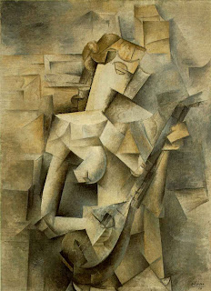
Mandolin
 http://www.artchive.com/artchive/P/picasso/tellier.jpg.html
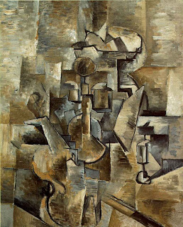
Braque Violin
 http://davidtmiller.wordpress.com/2008/11/12/information-distribution-systems-cubism-as-visual-language/
 http://artedeximena.wordpress.com/arte-contemporaneo/i-las-vanguardias-historicas/cubismo-y-esc/cta-retrato-de-ambroise-vollard-1910-picasso/
 http://www.metmuseum.org/toah/works-of-art/1999.363.63
Mandolin
 http://www.artchive.com/artchive/P/picasso/tellier.jpg.html
The musical instrument captures my eye in this image, i like the shading. Dark colors are used specifically brown and green, and different shades of those colors. Line texture and shape are being used. Center of design is the principle of design used. This influences my painting by shadowing my body around the background of my Picasso self portrait.
Braque Violin
 http://davidtmiller.wordpress.com/2008/11/12/information-distribution-systems-cubism-as-visual-language/
The Violin captures my eye, i like the contrast of the picture. Different shades of colors are being used mainly brown and a mixture of black. Line texture and shape are being used. Balance is being used, everything is equally spread around. This painting influences me to use different shades of one color in my Picasso self portrait.
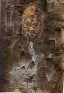
Ambrose Vollard http://artedeximena.wordpress.com/arte-contemporaneo/i-las-vanguardias-historicas/cubismo-y-esc/cta-retrato-de-ambroise-vollard-1910-picasso/
The mans face captures my eye, i like how his face is the lightest part in this dark piece. One main color being used which is black, the one light color to see the significance in the image. Line texture and shape are being used. Center of interest is being used to focus on the mans face. This painting influences me to make a significant color change in my self Picasso portrait.
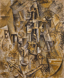
Still life With a Bottle of Rum http://www.metmuseum.org/toah/works-of-art/1999.363.63
The letters capture my attention, i like how letters are used in his artwork. The colors, are gold, brown, Grey, and black showing a stable emotion. Line texture and shape are being used. Balance is the principle of design being used as you can see everything is spread out trough out the painting. This influences me to put letters or some type of letter shape in my Picasso self portrait.
No comments:
Post a Comment