Friday, December 9, 2011
Assignment #13- Final Outline
Thursday, December 1, 2011
Assignment #12-Outline
A. We are the 99% and so are you!
B. I am the 99%, I have a college degree and cant find a stable job in this economy.
C. We need to make a movement to change our economy, put pressure on the government for support.
D. Financial transparency, Financial problems, Governments involvement,
Body
A. Financial Transparency
1. Americans are trying to get out of debt, and cant even find a job to make ends meat.
2. EDD doesn't see the necessity of money flow in our economy for non-employed Americans.
B. Financial Problems
1. Current colleges are being occupied and classes being missed due to not being able to afford current tuition's.
2. College graduates jobless still after 6 months of graduating, some even more than 12 months.
C. Governments Involvement
1. The government is not currently involved with the protesters occupying city's.
2. The government is trying to approve more financial aid for people who have filed for unemployment.
3.Government is being forced to make this economy better and accelerate with cash flow.
Conclusion
A. We will make change and proceed with improving our economy.
B. The 99% is joined together and strong and looking overall main problems, such as government involvement, financial problems, and financial transparency.
C. The 99% will take over the 1% and be 100% successful.
assignment #11
Documentary Film Note Outline:
I . History of Documentary Film
A. Pre-1900-The early documentary was a simple one shot captured in film. They will be simple things like workers leaving the factory, a boat leaving and a train leaving the station. Theses kind of films are called "actuality" films.
B. 1900–1920- Travelogue films were very popular in the early 20th century.They had early color movies. It was important for early films to move beyond the concept of scenic.
C. 1920s
1) Romanticism-
2)The city symphony- These kind of of documentaries showed the human ways. They show how humans live and how they react. They also had videos shown a man made way of life.
3) Kino-Pravda- Kino-pravda means "cinematic truth". These had varied lenses, shot-counter shot editing, time lapse,ability to slow motion, stop motion and fast-motion. This can render reality more accurately than the human eye.
4) Newsreel tradition-
D. 1920s–1940s-
E. 1950s–1970s
1) Cinéma-vérité-
2) Political weapons-
4) Documentaries without words-
Friday, November 18, 2011
Assignment #11- Documentry Film
I . History of Documentary Film
A. Pre-1900-Early film was dominated by the novelty of showing an event. They were single-shot moments captured on film: a train entering a station, a boat docking, or factory workers leaving work. These short films were called "actuality" films; the term "documentary" was not refered until 1926.
B. 1900–1920-Travelogue film were very popular in the early part of the 20th century. They were often referred to by distributors as "scenics." Scenics were among the most popular sort of films at the time.
C. 1920s-Different time period of change of documentries.
1) Romanticism-Flaherty filmed a number of heavily staged romantic films during this time period. Often showing how his subjects would have lived 100 years earlier and not how they lived right then.
2)The city symphony-The continental, or realist, tradition focused on humans within human-made environments. And included the so-called "city symphony". Such as Walters Ruttman's Berlin.
3) Kino-Pravda-Vertov believed the camera — with its varied lenses. Shot-counter shot editing. Ability to slow motion.
4) Newsreel tradition- The newsreel is a tradition. Newsreels were also sometimes staged but were usually re-enactments of events that had already happened. Not attempts to steer events as they were in the process of happening.
D. 1920s–1940s-The propagandist tradition consists of films made with the explicit purpose of persuading an audience of a point. One of the biggest film was leni Riefensthal's.
E. 1950s–1970s- Change of Documentaries again.
1) Cinéma-vérité- In other words it was also called Direct Media. Was dependent on some technical advances in order to exist: light, quiet and reliable cameras, and portable sync sound.
2) Political weapons-In the 1960s and 1970s, documentary film was often conceived as a political weapon against capitalism. Among the many political documentaries early 1970s; "Chile: A Special Report".
3) Modern documentaries- Box office analysts have noted that this film genre has become increasingly successful in theatrical release with films like " Super Size me". Compared to dramatic narrative films, documentaries typically have far lower budgets.
4) Documentaries without words-Films in the documentary form without words have been made from 1982 untill now.
Thursday, October 27, 2011
Assignment #10-Political Poster Analysis
2006
2010.54.1043 | OMCA COLLECTIONS
Purpose
-The documents purpose is to show that don't let the government completely control you like a puppet.
-Bush's was still president during 2006, and Americans were disliking how he was running things.
-This poster uses images of a man with American color jacket using Americans as puppets.
-This document is for people who believe anything the government tell them.
-This document suggests that people are ignoring the real facts, and believing the governments word.
-I believe at the time this poster was created it was really accurate.
Document Author
-No author.
-The writers motives are to convince Americans that the government will control you as a puppet.
Evidence, Support, and Outcomes
-Not every president completes everything he promises, the affects are believable.
-It uses logic emotion, to persuade its reader and to make it feel that the government does not complete its promises.
-The moral value is that is not good to promise something and not keep it.
-If the audience accepts this message they will see the reality of the government.
-If everyone in the world saw this message people would analyze their government more.
Overall Impression and Conclusions
-The overall impression is that the government can control you if you are on their political side.
-I believe this poster is a persuasive poster because it wants Americans to show how the government controls Americans.
2010.54.415 | OMCA COLLECTIONS
Purpose
-The documents purpose is to get all the Latinos attention and get health care.
The message of this document is to promote health care for all Chicanos and Latinos.
-It is important for this message to be delivered because a lot of Latinos do not have health care so its saying we should protest to get health care.
-The document communicates because it shows the welga bird with two swords. It uses really nice red and yellow. -On the top it says in really big letters, "Raza Health Conference."
-The audience are Latinos and field workers as well.
-The message suggest that the farmers need health care because they work on the fields and they can get sick.
-The beliefs are really accurate because it is directed to all the Latinos and the farmers. Which a lot of Latinos don't have health care til this day. Either we don't qualify or you have to have papers.
Document Author
-Pablo Neruda wrote the message.
-The writers motives is to get all the attention from the Latinos and let them know we can make a change or difference. If we fight for it, all of the Latinos can get health care.
Evidence, Support, and Outcomes
-The details that the documents use are the welga bird. That is a big thing becaus that represents the Latinos.
-The emotions show a good and powerful feeling.
-The audience is likely to feel worried and willing to go fight for their rights.
-The ethical values are used to communicate to the message are Chicano and the picture.
-If the audience accept the message all the Chicanos will come together and make a difference.
-All the farmers and Chicanos will get health care.
Overall Impression and Conclusions
-The overall impression of the message is to tell the Latinos and farmers to get health care.
-I believe is an argument because its trying to fight for the farmers rights.
Thursday, October 13, 2011
Assignment #8 Cubism & Pablo Picasso
Mandolin
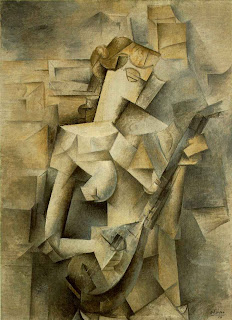 http://www.artchive.com/artchive/P/picasso/tellier.jpg.html
Braque Violin
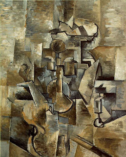 http://davidtmiller.wordpress.com/2008/11/12/information-distribution-systems-cubism-as-visual-language/
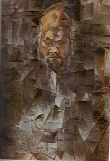 http://artedeximena.wordpress.com/arte-contemporaneo/i-las-vanguardias-historicas/cubismo-y-esc/cta-retrato-de-ambroise-vollard-1910-picasso/
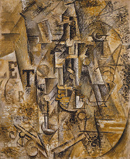 http://www.metmuseum.org/toah/works-of-art/1999.363.63
Friday, October 7, 2011
Assignment #7 Principles of Design
• Balance - a feeling of equality of weight, attention, or attraction of the various elements within the composition as a means of accomplishing unity
http://www.nyu.edu/classes/keefer/body/sci.html
• Movement - the suggestion of action or direction, the path our eyes follow when we look at a work of art
http://www.nyu.edu/classes/keefer/body/sci.html
• Repetition and rhythm - the act of repeating an element either regularly or irregularly resulting in a rhythm of the repeating elements
http://hannakaye.wordpress.com/
• Emphasis - the stress placed on a single area of a work or unifying visual theme
http://www.vldb2005.org/tourism/main.php?day=20050830
• Simplicity (a.k.a. visual economy) - the elimination of all non-essential elements or details to reveal the essence of a form
http://www.elfwood.com/~hession/Contrast.2796374.html
• Contrast - the difference between elements or the opposition to various elements
http://www.elfwood.com/~hession/Contrast.2796374.html
• Proportion - the relation of two things in size, number, amount, or degree
http://lynbrown.com/?p=1262
• Space - the interval or measurable distance between objects or forms (two dimensional or three dimensional)
www.Google.com
• Unity - the relationship between the individual parts and the whole of a composition
 http://www.artreview.com/profile/VisionaryArtistIntuitivePsycgic
Friday, September 30, 2011
Asssingment #6 Pablo Picasso Cubist Painting

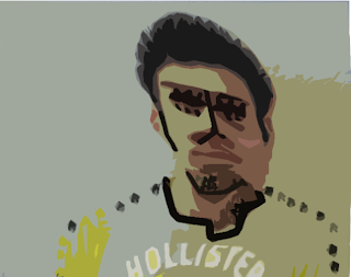
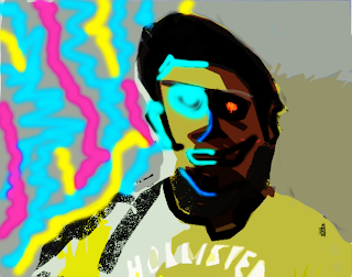
Me With a Twist
My Picasso painting is called “Light Shadow”. My main influence on my painting was the color Picasso used. He influenced me to show the significance in my painting, which was light and dark. Picasso used different colors in different era paintings. I wanted my painting to look like Picasso’s are in a way, but yet somehow have my own taste and incorporation in it. In my work of art i used Line, Color, and shape. My biggest incorporation was my face, yet i made it look like a Picasso self portrait.
To create my artwork I worked in the multi media medium. It was as self portrait of myself, in which i took a picture of myself and uploaded it to photo shop. Then I warped and painted my portrait to make it look like a Picasso painting. The assignment was to create a self portrait of yourself, but to make it look like if Picasso had painted it in one of his era’s. I made it look a lot like his cubism period in which Picasso made most of his art work with shapes.
I used Value in my Picasso self portrait painting, on the left side of painting i put very light colors and bright, then to my right side i put dark colors to show the nice and mean side of me. I also used lines to show the edges and where things ended on my portrait. I mostly used it around my face and half of my body. I also used color to show the lightness of my portrait and significance in it. The final element of design i used was shape to resemble to Picasso’s cubism period.
In my portrait I wanted to show two sides of my self, but yet still incorporate Picasso’ style in my painting. On the left side of the painting I put light lines and light color painting on the left side of my face. I put to show how happy i can be, and also nice. On the right side of my face i used dark colors and no lines to show the mean and sad part of me. Overall I used a happy and sad emotions.
Of all the portraits i have made of myself, I believe this portrait was my most successful. It really looks like a Picasso painting. If i could do something to improve, I would take more time in studying Picasso art work to be on point.
Thursday, September 29, 2011
Assignment #5 Elements and Principles of Design
• Line - an actual or implied mark, path, mass, or edge, where length is dominant
• Form - the mass of the shapes
http://cutestfood.com/2447/apple-art/
• Texture - the structure and minute molding of a surface (rough, smooth, etc.)
• Value - the degree of lightness or darkness of a given color
http://www.debate.org/debates/Wealthy-is-a-relative-term-rather-than-an-absolute-one./1/
• Color - a pigment
• Shape - any flat area bound by line, value, or color
Thursday, September 22, 2011
Assignment #4 Pablo Picasso WebQuest
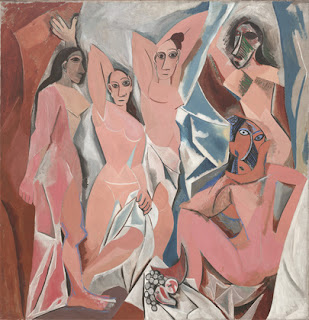 Les Demoiselles d'Avignon
1. What is his full name? Pablo Diego José Francisco de Paula Juan Nepomuceno María de los Remedios Cipriano de la Santísima Trinidad Clito Ruiz y Picasso 2.When was he born? 25th October, 1881 in Malaga in Spain. 3. When did he die? 8th April 1973, Mougins France. 4. Find out the names of his parents,brothers or sisters. José Ruiz and María Picasso y López, Parents Sister Conchita Y Lola 5. What were the names of Picasso´s wives or lovers? What were their nationalities? Female Olivier, Holga knokhlova and Maecelle Humbert, Jean Cocateu, Jean Hugo, and Juan Gris. 7. What are his children and grandchildren´s names? Paul, Maya, Claude, Paloma. |
9.Why did he go away from Spain? Where did he live? He moved to pursue his career in art, he lived in France for most of his life. 10. In which way did he influence the concept of painting? His father begin teaching him at a very young age, started painting of age of seven. 11. Main events that influenced his life. His father mainly influenced his life, started teaching him and giving him lessons at age of seven. 12. Describe some people, objects, and/or animals in his paintings(what they look like,the clothes they are wearing,their personality). They are posing in random positions. Different girls have different faces, there personality looks very serious. 13. Is there anything special about the people´s faces or bodies? They are abstract, like there faces are mixed. They are not wearing any clothes at all, their are completely naked. Light colors for their skins, and a lot of women, and only women. Some sitting and some standing. |
Thursday, September 8, 2011
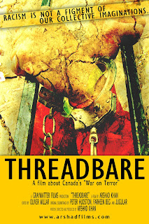
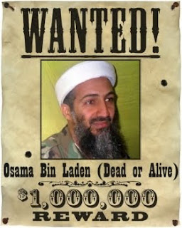
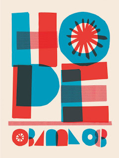
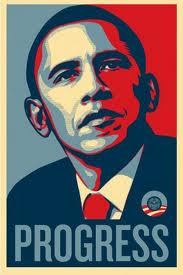
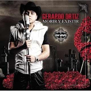
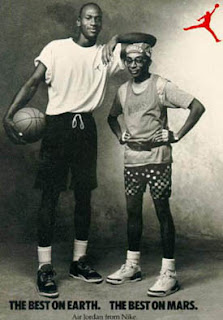
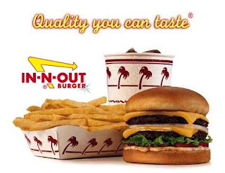
Assignment #3 How do signs/advertisment visually communicate an idea.


Tuesday, August 30, 2011
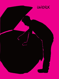
Assignment #2- iWORK Photoshop Silhouete
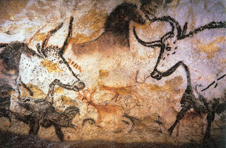
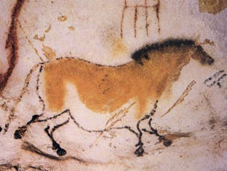
Assignment #1- Cave Painting
1) What are cave paintings?
